There are two ways to build a chart for your dashboard: 'pick a template' and 'start from scratch'. In this article, we are going to explain how to build a chart from scratch.
Step 1: Dashboard
Go to 'Reporting' and click on 'Dashboard'.

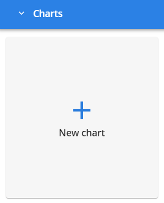
Step 2: New Chart
Click on ‘+ Chart' in the bottom right corner, then, 'New chart’, to get started with building your chart.
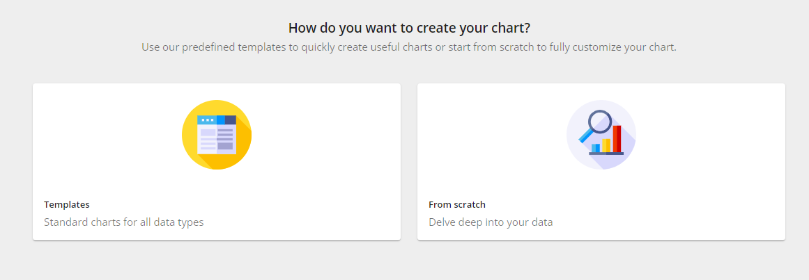
Step 3: From Scratch
Choose how you want to create your chart. In this case, we're going to show you how to build a chart from scratch. So please click on 'From scratch'.
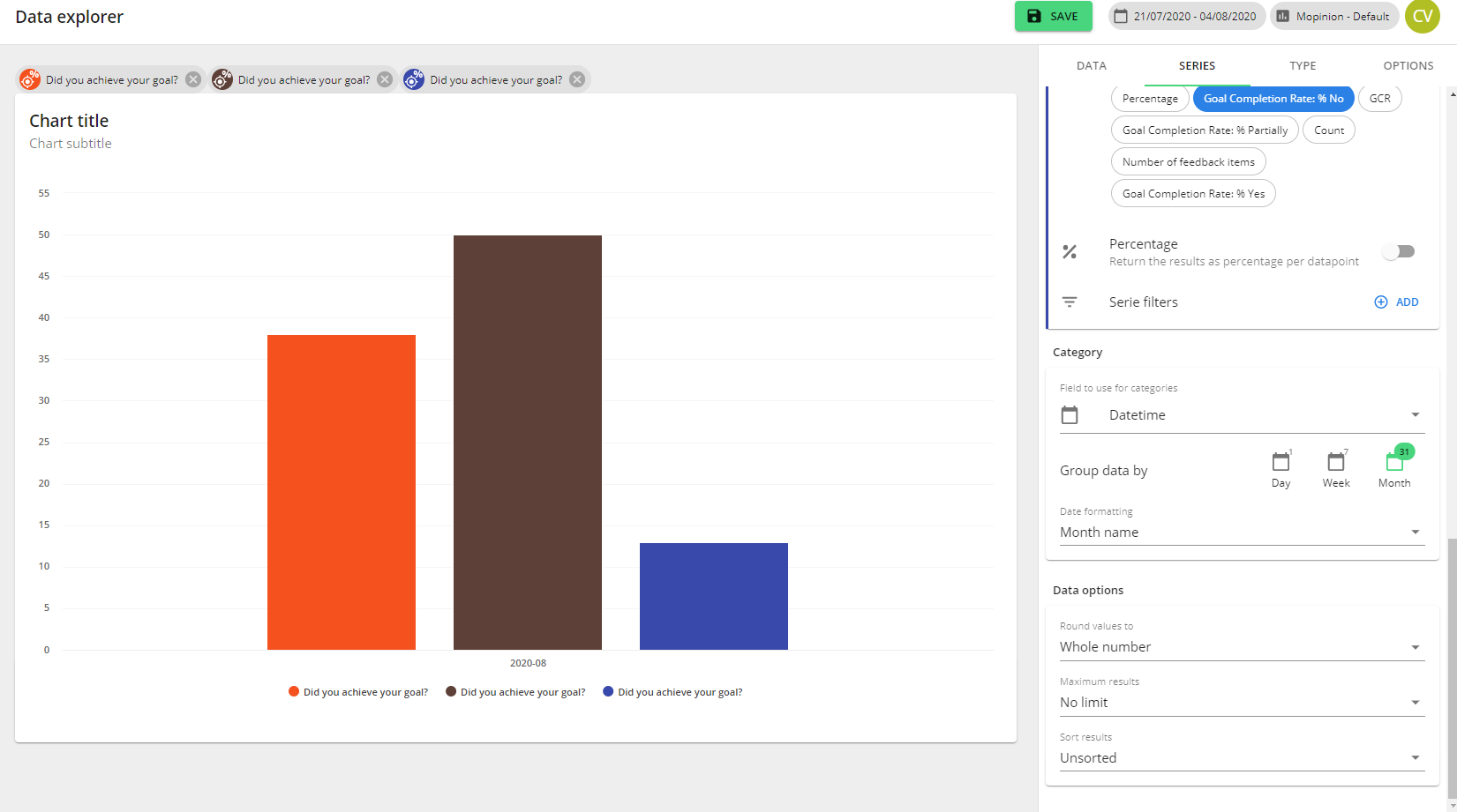
Step 4: Chart Title
Once you've chosen this option you will see the screen below. Fill in your chart title and subtitle in the top left corner, which will be shown above your chart on your dashboard.

Step 5: Data Set
Choose your data set. Then, drag and drop one of your scores. For example, let's use GCR (Goal Completion Rate). For GCR, typically you want to analyze 3 different values: Yes, Partially and No. Therefore, you have to select the same data series 3 times. Just click on this score 3 times and you will see 3 labels of these series above your chart.
Once you have selected a data series type, our software will automatically highlight other relevant series you can compare this series with.
It is also possible to compare data fields from different data sources in one chart. Please read this article for more information on how to do this.
It is only possible to use matching data series. For example, only NPS with NPS.
Edit your charts
Step 6: Data Series
Now you can set up the following for your data series: name, colour, calculation, the number of decimals, sort data and limit.
Because we've selected the same 3 data series for the values: Yes, Partially and No, now you need to select a calculation for each data series.
So for the first data series > Goal Completion Rate % Yes

The second data series > Goal Completion Rate % Partially
The third data series > Goal Completion Rate % No
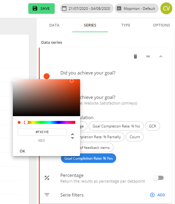
Step 7: Design
So now that you've selected your data series, you can customize your data with different colours.
Step 8: Filters
The score you've chosen, in this case, the Goal Completion Rate (GCR), can be linked with other data. For example, it can be linked with the date or browser type. To apply this, you have to add an extra filter. After you've selected ‘(+) ADD', next to 'Serie filters’, you must choose the data you want to link GCR to.
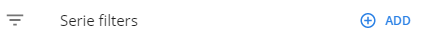
After selecting the data type you want to link, you will see a single line where you can fill in your filter.
For example, we use 'Browser'.

Step 9: URL
Additionally, you can add a filter with a URL. This is handy for viewing your score on specific page URLs. This is done similarly as described in step 8.
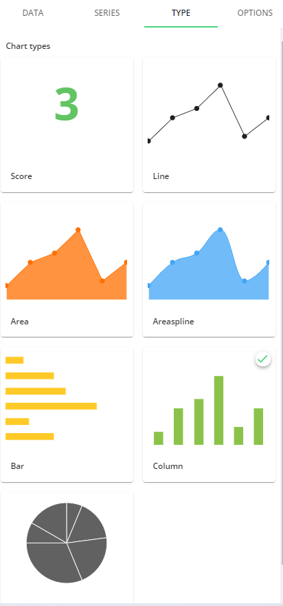
Step 10: Chart Type
If you're satisfied with your filter settings, you can then select different chart types. You have the following options:
Score charts
Line charts
Area-spline charts
Bar charts
Column charts
Pie charts
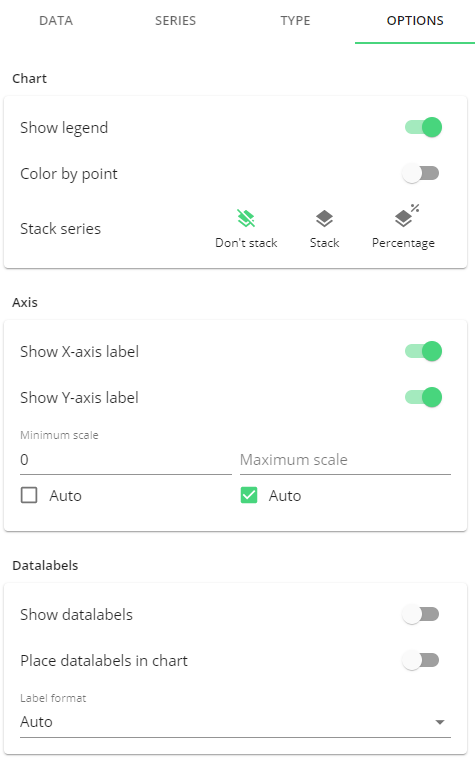
Step 11: Options
For more customization options, click on the category 'OPTIONS'. Here you can make additional format changes to your chart. For example, you can:
Change the stack series
Turn on/off the X- and/or Y-label.
Manually or automatically adjust the min and max of the Y-axis scale
Turn on/off your data labels inside the chart
Turn on/off your legend
Step 12: Save
The last step is saving your chart, this is done by clicking on the green ‘SAVE’ button in the top right corner. Don't forget this!
Now you're able to build charts in expert mode!