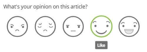
Let’s say we want to know how many people like our article. We will use the rating with emojis element.
In our graph, we would like to see how often someone perceives our article as negative (hate & dislike), neutral (neutral) and positive (like & love). We add the rating element 3 times to our graph, filter each series to the corresponding answers, and set them to Count:

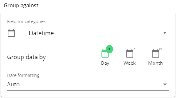
We want to compare the different answers per day, therefore, we group the data against ‘Datetime’:

If we were to compare three days, the graph would look like this:

If we want to see the data as a percentage, the graph would something like this:
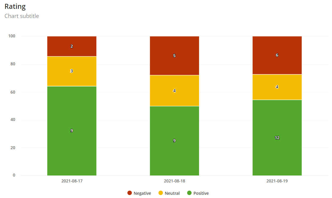
Now, we can better see that, for example, in at least half of the responses, the answer was positive for all three days. This is mainly handy if you have a high response rate.